
Material and Finish Comparisons
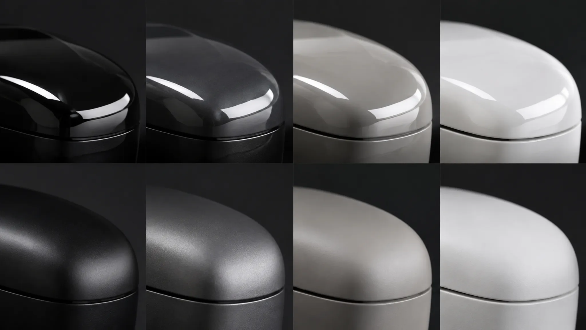
A finish direction can change how a concept render communicates mass, edge quality, scale, and intended use. A glossy surface may trace a long transition through a narrow highlight; a matte direction may make the same form easier to inspect while weakening reflection cues.

The review problem is attribution. Is the visible difference coming from roughness, reflected light, geometry, viewing angle, exposure, or several changes at once?
A useful material rendering comparison isolates those variables before the team treats the image as a product decision. The render can show a visual direction. It cannot establish measured gloss, coating chemistry, durability, cleanability, tactile behavior, manufacturability, safety, compliance, or production readiness.
More specific pages
These pages continue the topic in smaller, more specific directions.
Start With a Fixed View and Lighting Setup
Comparing gloss and matte finishes becomes unreliable when the camera, environment, or light placement changes between images. A different viewing angle can move a highlight across a curved shell, while a different environment can make the same digital material appear more reflective.
Set the comparison frame before adjusting the finish direction. Record:
- Camera position and lens or field-of-view setting
- Object rotation and visible surfaces
- Geometry version
- Key-light position, size, and intensity
- Environment or background used for reflections
- Exposure, tone mapping, and display context
- Material parameters changed between versions
The fixed view does not need to represent every future use context. It needs to make the intended difference inspectable. Use one alternate view or lighting condition afterward, with the material parameters unchanged, to see whether the impression persists.
What does this finish direction make visible under the same visual conditions?
That question is more useful than asking which material “looks better.” It connects a visible cue to a review consequence.
Compare the Highlight Before Naming the Finish
Begin with what the render shows. Do not begin with a physical material label.
- Is the reflected light narrow or broad?
- Are its edges distinct or diffused?
- Does the highlight follow the form consistently?
- Does it break at an edge transition?
- Does it disappear across flatter areas?
- Does brightness suppress surface color or local detail?
- Does the reflection reveal curvature or conceal it?
A sharper highlight often suggests lower apparent roughness in the digital material. A broader reflection pattern may suggest higher digital roughness or a lighting condition that spreads reflected light.
That remains an interpretation of the shader and scene, not a measurement of a physical surface. Curvature, surface relief, and edge radius can produce similar changes. Trace the highlight across more than one surface, including a broad panel, a control area, and a tight transition.
A finish direction that reads clearly on a broad panel may become ambiguous around a handle, recessed control, or unresolved edge break. Record the region where the interpretation changes.
What Roughness Changes in a Digital Render
In rendering and texturing workflows, roughness is used to represent how broadly or sharply reflected light appears. Lower apparent roughness tends to produce more defined reflections; higher apparent roughness tends to spread the reflection and reduce its distinctness.
The terminology is useful for recording a concept study. Blender documentation describes roughness within its shader models, while Adobe Substance 3D documentation describes roughness as a texture or material control. These references explain digital behavior, not the specification of a physical finish.
A roughness map can vary across the object. One region may carry a broad, muted reflection while another produces a tighter highlight. That variation can communicate separate finish zones, a polished edge, a textured insert, or a soft-touch direction in the concept.
Keep the visible result and the digital cause separate in the review record:
- Observed: The top panel shows a wider, less distinct reflection.
- Inferred: The digital roughness appears higher in that region.
- Unresolved: The physical surface specification and measured appearance are unknown.
- Next action: Compare the direction with a material reference or physical sample.
A roughness value is not a direct substitute for measured surface-finish data. Different rendering models can produce different visual results from parameters with similar names, so record the renderer and parameter context when a comparison may move between tools.
Gloss and Matte Finish Renders Under Consistent Lighting
A gloss-versus-matte comparison is most informative when both directions share the same geometry, camera, environment, exposure, and display treatment.
Gloss direction
A glossy direction can make form transitions legible through reflection. A continuous highlight may help reviewers follow a crown, shoulder, or edge break across the body. Strong reflection contrast can also give the concept a more reflective visual character.
The same direction can hide information. Overexposed areas may suppress surface color and local form detail, while a dark environment can create a dramatic reflection pattern that does not persist in another setting.
Review the highlight, not the drama.
Matte direction
A matte direction can reduce the distinctness of reflected images and distribute light more broadly. This may make the silhouette, color block, and broad massing easier to inspect. It can also weaken the cues that communicate curvature or surface continuity.
A matte appearance does not automatically mean that the underlying geometry is clear. Soft lighting and a low-contrast background can flatten the object further.
Compare the tradeoff
- Which transition is easier to trace?
- Which surface boundaries are easier to separate?
- Which areas lose detail in bright reflection?
- Which direction gives the stronger scale cue?
- Does the difference persist in a second view?
- Are geometry and lighting unchanged?
The answer may vary by product region. A broad outer shell, recessed control panel, and flexible grip may need different visual directions in one concept study. Record those regional differences instead of assigning one finish behavior to the whole object.
Separate Material Cues From Lighting Cues
Reflected light spread in renders is shaped by lighting direction, source size, environment contrast, surface orientation, camera position, and the material parameter. Research on appearance perception links perceived gloss with cues such as highlight brightness, contrast, coverage, and reflection sharpness, while also showing that geometry and illumination affect the reading together.
This creates a common review error: a new lighting setup is interpreted as a new finish.
- Observe the visible cue. Describe the reflection without naming its cause: “The side wall carries a narrow, high-contrast band.”
- State the likely interpretation. “The comparison suggests a sharper reflected-light response, possibly from lower apparent roughness.”
- Test the interpretation. Hold the light and camera constant. Check the same region on another surface or from an alternate angle.
- Record what remains open. Note whether the physical finish, measured gloss, and behavior under another environment still require evidence.
If the effect moves with the light, illumination may carry much of the impression. If it follows the material boundary across views, the digital material assignment becomes a stronger explanation. The comparison suggests a cause; it does not settle the physical one.
Geometry Can Masquerade as Finish
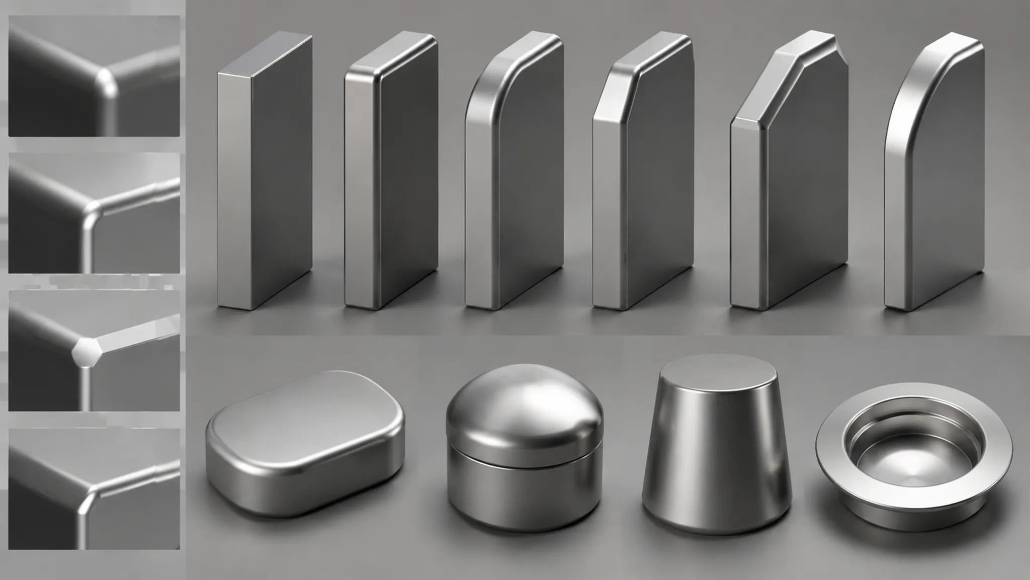
A finish comparison is weak when the geometry changes between directions. Curvature, relief, edge radius, and surface orientation all alter reflection patterns.
A tighter edge break can create a sharper highlight. A broader radius can stretch the reflection across a larger area. Fine surface relief may increase highlight coverage, while excessive structure can reduce the distinctness of reflected images.
Compare geometry before changing the material conclusion. Overlay silhouettes or inspect the same feature in a neutral clay-style preview. This does not replace the finish render; it identifies whether the form is producing the observed cue.
Check these areas first:
- Long convex panels and concave transitions
- Chamfers, fillets, and unresolved edge breaks
- Raised buttons and recessed controls
- Seams and boundaries between material regions
- Textured or patterned surfaces
A concept render may make a surface look more refined because the edge break is unresolved. Route that question to the form study or CAD review rather than forcing it into the finish decision.
Use Reflection Patterns as Scale Cues
A reflection pattern can support a visual reading of size and curvature, but the cue depends on the environment used in the render. A structured environment can show how a curved surface turns through space; a small bright source can emphasize an edge; a featureless environment may provide too little information for comparison.
For presentation boards, use enough environmental structure to reveal the form without overpowering it. Keep the environment unchanged across finish directions, and record whether the reflection is part of the material study or a separate presentation choice.
A convincing reflection does not prove the object’s dimensions. It supports a reading of curvature and massing; actual size remains tied to dimensions, scale references, CAD, or physical review.
Record Roughness Variation by Region
A single overall roughness value can conceal the most useful comparison. Concepts often contain several visible regions, each with a different visual role.
| Region | Visible cue | Digital interpretation | Review question |
|---|---|---|---|
| Outer housing | Broad, low-contrast reflection | Higher apparent roughness | Does the massing remain legible? |
| Edge break | Narrow highlight following the transition | Geometry and roughness both contribute | Is the radius fixed between versions? |
| Control surface | Distinct reflection boundary | Separate finish assignment | Is the boundary intentional? |
| Grip zone | Broken or uneven reflection | Roughness variation or surface relief | Does the image show a direction only? |
The table documents the decision without pretending that the render identifies a physical process. Preserve the map version, mask, or region name when localized variation affects the comparison. The next reviewer should be able to tell whether the change came from a finish assignment, texture variation, geometry revision, or lighting adjustment.
When Metallic and Specular Controls Confuse the Review
Metallic and specular controls describe rendering behavior within a particular material model. They do not establish that the product uses a specific metal, coating, or manufacturing process.
Use these controls to explain a visible response only when the tool context is recorded. A metal-like reflection may suit a concept direction, but the image does not identify the eventual physical material.
- Does the reflection remain coherent across the form?
- Are bright areas clipped?
- Does the base color remain readable?
- Does the object retain its intended silhouette?
- Does the reflection support the intended product character or use context?
- Does the image imply a premium, technical, or fragile character that was not intended?
The last question concerns communication, not market prediction. Record the unintended implication for discussion, then route physical material selection to the appropriate technical process.
A Practical Comparison Sequence
- Establish the baseline. Render the same geometry from the same camera with a controlled environment. Keep exposure and display treatment consistent.
- Isolate the finish change. Change the roughness, reflection, metallic, or texture control that defines the direction. Do not change geometry and lighting in the same pass.
- Inspect visible highlights. Compare width, sharpness, contrast, coverage, continuity, and clipping.
- Check geometry. Review edge breaks, curvature, relief, and material boundaries.
- Use one alternate condition. Change the view or light once, with the material direction held constant.
- Record the handoff boundary. Separate visual conclusions from questions requiring a sample, specification, calibrated measurement, engineering review, manufacturing review, or physical testing.
The output should be a decision record, not a collection of attractive images.
Common Review Mix-Ups
“The sharper render has a higher-quality finish.”
Sharpness is a visible reflection cue. It does not establish durability, cleanability, scratch resistance, or production quality.
“The roughness number is the physical gloss value.”
A roughness parameter belongs to a digital material model. Physical gloss requires defined measurement conditions and appropriate material evidence.
“The same material should look the same in every view.”
Lighting, geometry, viewing angle, reflected environment, and display conditions can change the visible reading without changing the digital finish.
“A photorealistic render confirms the material choice.”
Photorealism improves presentation. It does not validate physical performance, dimensions, mechanisms, ergonomics, safety, compliance, or manufacturability.
“A material change explains every reflection change.”
Geometry and illumination can create similar differences. Compare the scene record before assigning the cause.
What Digital Finish Renders Leave Unresolved
Available references support a strong explanation of digital appearance, lighting, geometry, visual perception, and the limits of reproducing real-world gloss on screen. They are less informative about physical finish performance, wear, cleanability, tactile behavior, manufacturing consistency, safety, compliance, and exact physical gloss values.
Keep these questions open unless separate evidence is available:
- What physical material or coating will be used?
- What gloss or reflectance value will a sample produce under defined conditions?
- How will the surface respond to scratches, cleaning, handling, or wear?
- What tactile behavior will users experience?
- Can the finish be manufactured consistently?
- Does the surface create glare concerns in the intended use context?
- Does the direction meet a relevant safety or compliance requirement?
- Will a physical sample match the display appearance?
A render can identify which questions deserve attention. It cannot answer them on its own.
Handoff Record for a Material Comparison
Carry these details into the next review:
- Finish directions compared
- Geometry version for each render
- Primary camera and alternate view
- Light placement and environment
- Exposure and display context
- Digital parameters or texture regions changed
- Visible cue being compared
- Likely rendering cause
- Geometry or lighting factors that may also contribute
- Physical question left unresolved
- Required sample, specification, measurement, review, or test
A concise record might read:
Direction B produces a broader, lower-contrast reflection on the outer shell under the fixed camera and environment. The result suggests higher apparent digital roughness, while the shoulder radius remains a possible contributor. Compare the same region in the alternate view, then route physical gloss and cleanability questions to material documentation or sample review.
That record is specific enough for design review and restrained enough to preserve the boundary between concept visualization and technical validation. Decide the visual direction now; leave physical behavior, production conditions, and measured appearance with the evidence that can answer them.

Sources
- Blender Manual: Glossy BSDF
- Blender Manual: Principled BSDF
- Adobe Substance 3D Documentation
- The effect of geometry and illumination on appearance perception of different material categories
- The influence of Fresnel effects on gloss perception
- Color and gloss constancy under diverse lighting environments
- Gloss management for consistent reproduction of real and virtual objects
- Analysis of Gloss Unevenness and Bidirectional Reflectance Distribution Function in Specular Reflection